Visualizing the Future Workforce
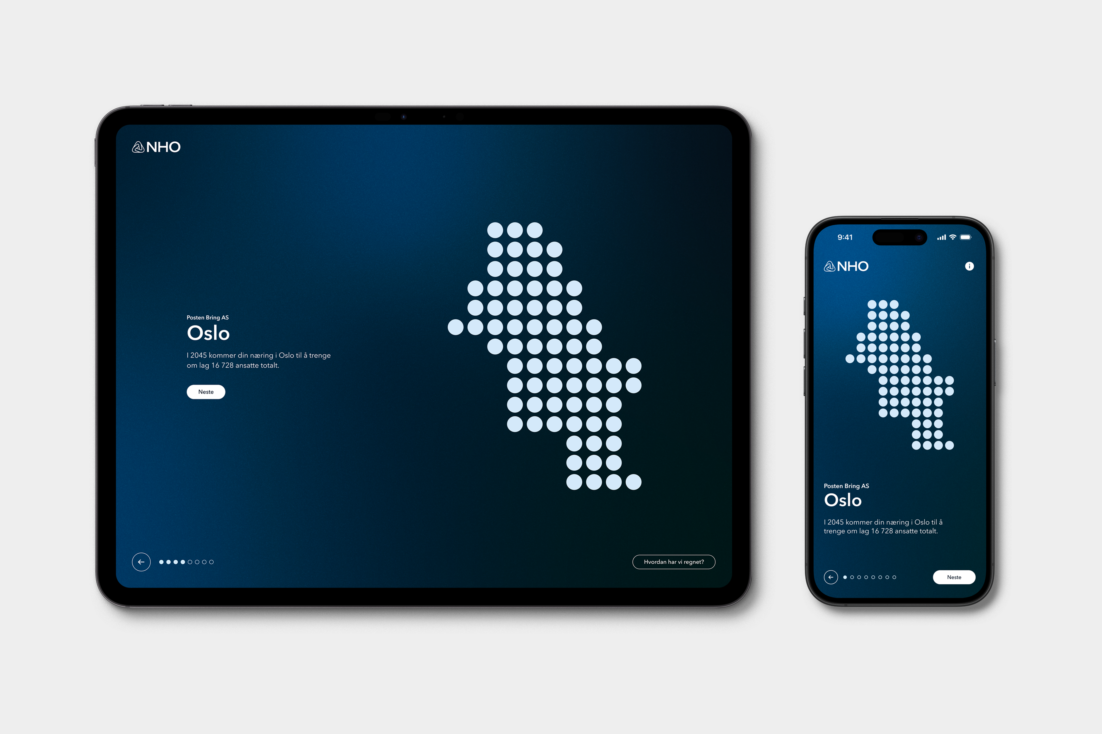
At their annual conference, NHO wanted to highlight that the shortage of labor represents the single greatest challenge Norwegian businesses are expected to face in the future.We developed a personalized and interactive digital tool that helped business owners explore future workforce and revenue scenarios. By combining public data with company-specific insights, the tool visualized current and projected employee counts, revenue development, and future staffing needs.
Users could test different policy scenarios and immediately see how these would affect projected labor shortages, turning complex economic forecasts into actionable business insights.The solution was built on data from public sources, including SSB, alongside proprietary analyses and forecasts developed by NHO’s economists.
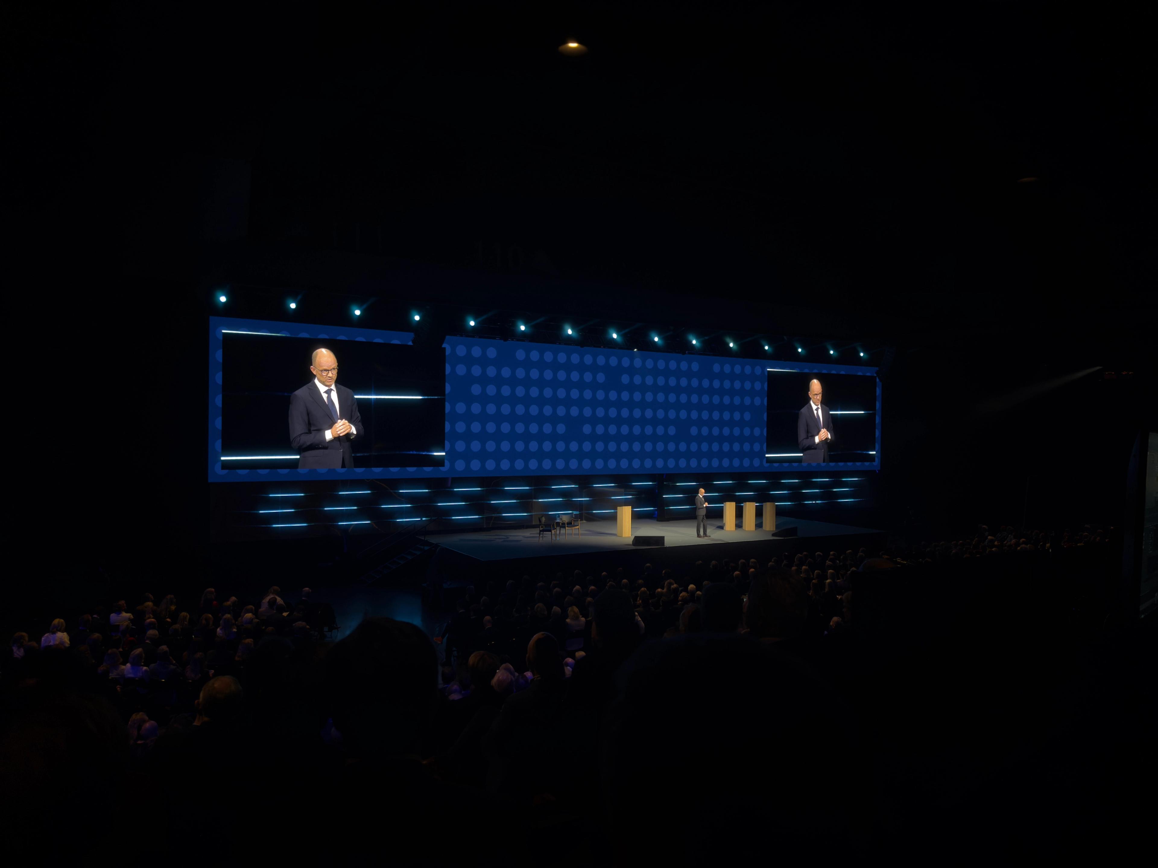
The graphics from the digital tool became a key element at NHO's annual conference, where an animated backdrop for the main stage was also developed, along with digital screens showcasing the various speakers.